
I wrote the first version of this post in 2021, and reading it again this week, it was mostly a list of good intentions: offer great service, build trust, be personal. All true, and almost no help when you are staring at your own shop wondering why people look around and leave. So I have started again, and this time I did something more useful than thinking about it: I spent a morning shopping on one of our own store templates, WearTrend, the way a real customer would. I browsed, filtered, picked a size, filled a bag, checked out with a made-up name and address, read the confirmation, and saved a couple of things for later.
This guide follows that same path, from the first second someone lands on your shop to the day they come back for a second order, because that second order is where an online shop starts to work. At each step I’ll show what I saw, what research says about why people drop out at that point, and what you can do about it, whether you sell dresses, coffee beans or garden tools.
Why most visitors leave without buying
It helps to start with a realistic picture, because otherwise every visitor who leaves feels like a failure. The Baymard Institute, which has spent years testing checkouts with real shoppers, averages the cart abandonment rates from 50 different studies and arrives at about 70%. Seven out of ten people who put something in a cart don’t complete the order.
That sounds brutal until you look at why. In Baymard’s own survey, 42% of US online shoppers said they had abandoned a cart because they were just browsing or not ready to buy. They were window shopping, comparing prices, or saving ideas for a birthday next month. You can’t fix that, and you shouldn’t try to pressure it away.
The interesting part is what the rest said, the people who wanted to buy and still didn’t. Among them:
- 40% left because extra costs (shipping, tax, fees) were too high;
- 20% because delivery was too slow;
- 19% because they didn’t trust the site with their card details;
- 18% because the site wanted them to create an account;
- 17% because the checkout was too long or complicated;
- 17% because the website had errors or crashed;
- 13% because of an unsatisfying returns policy;
- 12% because they couldn’t see the total cost up front.
Read that list again and notice that almost none of it is about the products. It is about surprises, slowness, doubt and friction. That is good news, because every one of those is a design and content decision you control. Most of what follows is about removing them one by one.
The first screen: show what you sell and why to buy here
When WearTrend’s home page loaded, three things told me what kind of shop it was before I had scrolled at all. The hero said “Women’s Fashion” with one line about the new season and the sizes it comes in. Right beside it, four category tiles (Dresses, Skirts, Trousers and a Sale tile) each showed how many styles were inside: “48 styles”, “32 styles”, “27 styles”. And the thin bar at the very top of the page said “Free delivery on orders over $80”.
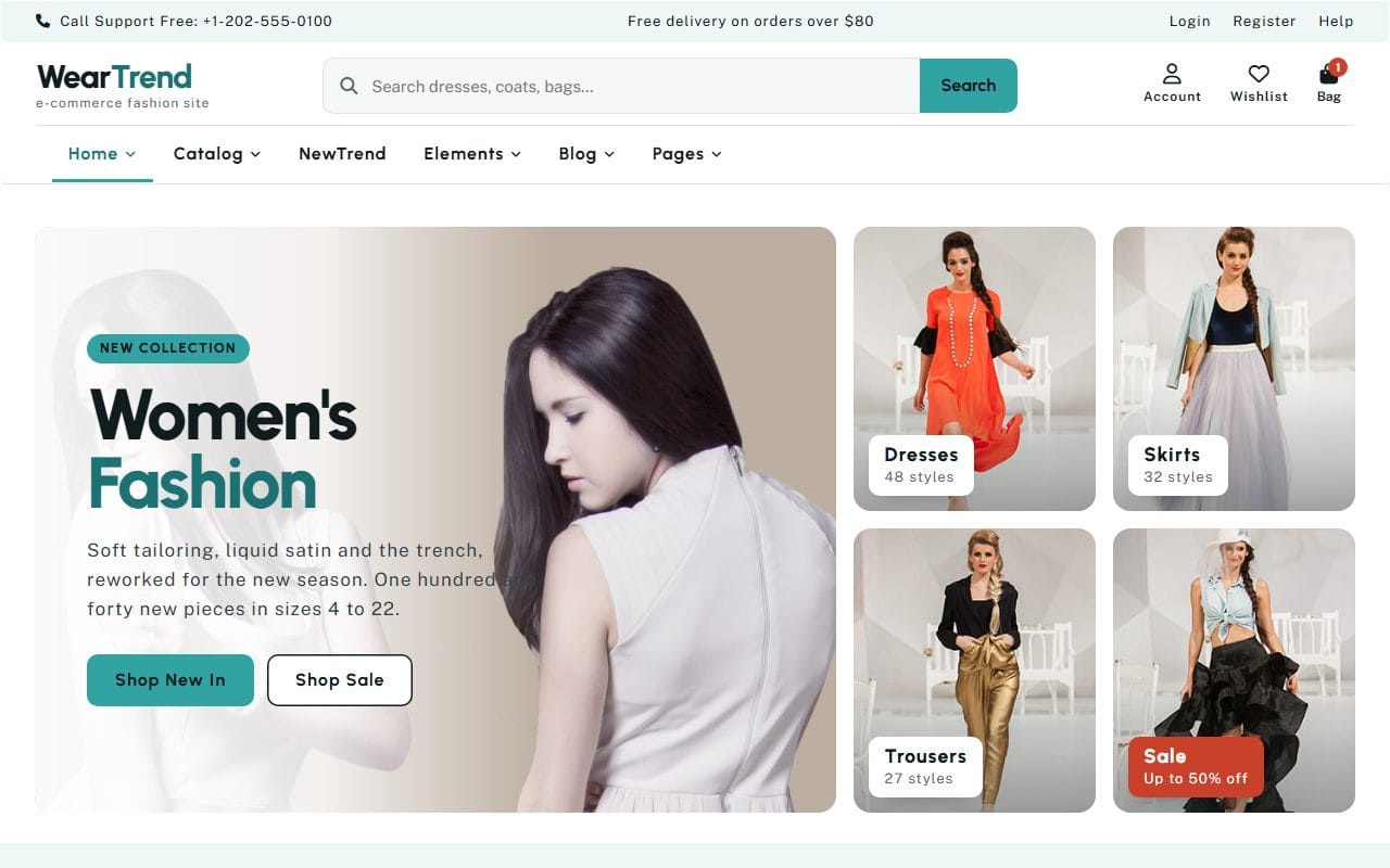
That last detail matters more than it looks. Remember that 40% of would-be buyers left over extra costs. Telling people the delivery threshold on the first screen, and repeating it on every page, means the cost of delivery is never a surprise at checkout; if anything, it becomes a reason to add one more item. If your delivery is a flat fee, say the fee. If it is free over a certain amount, say the amount. Hiding it until the last step is the single most common way shops lose orders they had already won.
The category tiles with counts do something similar for browsing. A shopper who came for a dress can see in a glance that there are 48 of them and tap straight in, instead of scrolling past a slideshow to find a menu. For a shop, the browsing should start on the first screen, not after it.
And there is a search box in the header, wide and obvious, with a placeholder that suggests what to type (“Search dresses, coats, bags…”). People who search usually know what they want, which makes them some of your most valuable visitors. Don’t hide search behind a small magnifying-glass icon on a shop.
Help people find the right thing quickly
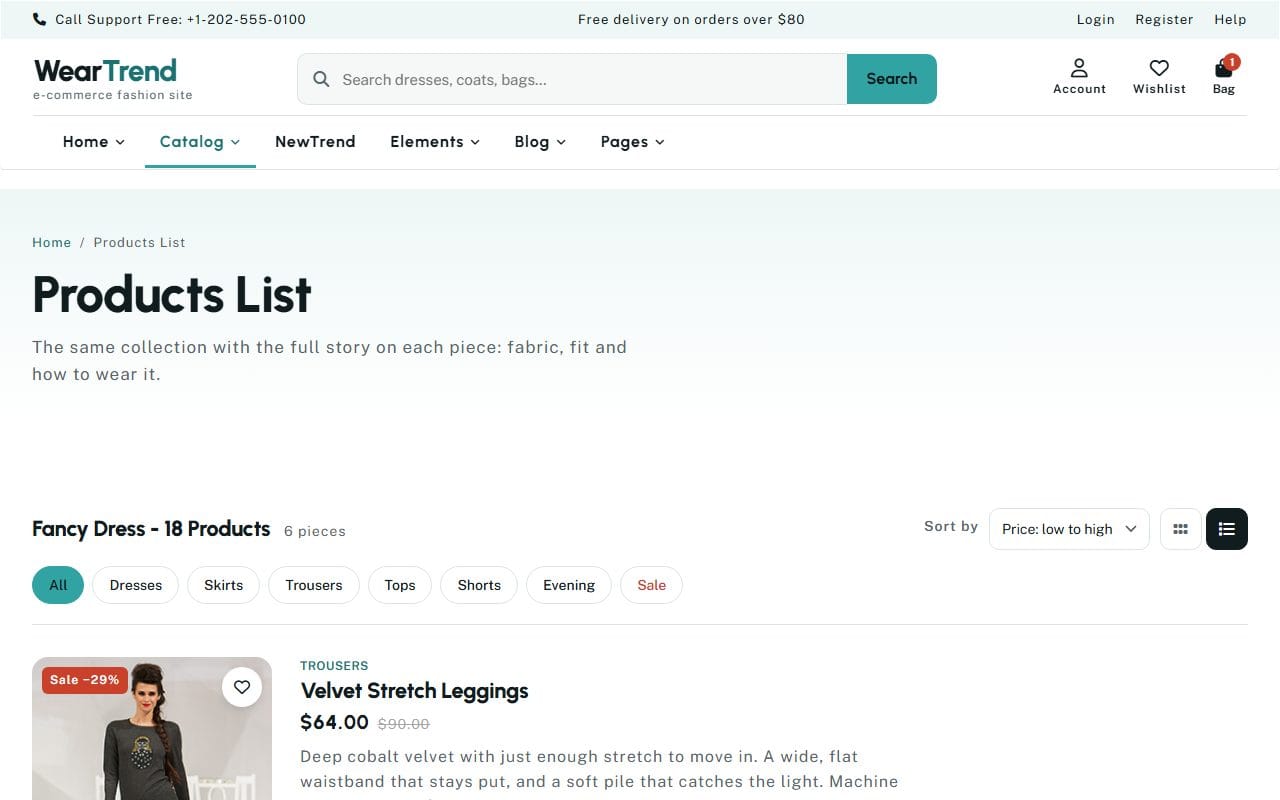
On the product list I tried the two things I always try first in someone else’s shop: narrowing down and reordering. A row of chips across the top (All, Dresses, Skirts, Trousers, Tops, Shorts, Evening, Sale) filters the list in place, and a “Sort by” menu offers price low to high, price high to low and name. When I chose “Price: low to high”, the Velvet Stretch Leggings, which were on sale, jumped to the top, which is exactly what should happen and, in my experience testing shops, not something you can take for granted.
A few things that make product lists easier to shop, whatever your platform:
- Filters that match how people think about your products. For clothes that is type, size and occasion; for coffee it might be roast, origin and grind. Look at what customers ask you, and filter by that.
- The price on every card, with the original price shown if something is on sale. Nobody should have to open a product just to see what it costs.
- Real photos at the same size and angle, so the grid reads cleanly and products can be compared side by side.
- A clear count (“6 pieces”), so people know when they have seen everything in a filter and don’t keep scrolling for more.
Let people add to the bag without a detour
This was the moment I liked most. On my phone, each product card in the list has its sizes right there: XS, S, M, L, XL. I tapped M on the Gold Satin Tapered Trousers, then “Add to bag”, and a line appeared right under the button: “Added to your bag, size M”. No page change, no pop-up covering the screen, no wondering whether it worked.
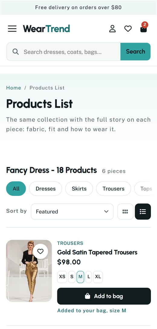
Two small design decisions are doing a lot of work here. The first is that a returning customer who already knows their size can buy several things from the list without opening each product, which is how people actually shop when they know a brand. The second is the confirmation itself. Feedback that is quiet but unmistakable keeps people browsing; feedback that interrupts them (a full-screen “Item added!” modal that has to be closed) makes every extra item feel like work.
Let the product page do the selling
Someone who opens a product page is interested. Your job now is to answer every question they might have before they think of asking it. On WearTrend’s product page for those same trousers, here is what was within one screen of the top:
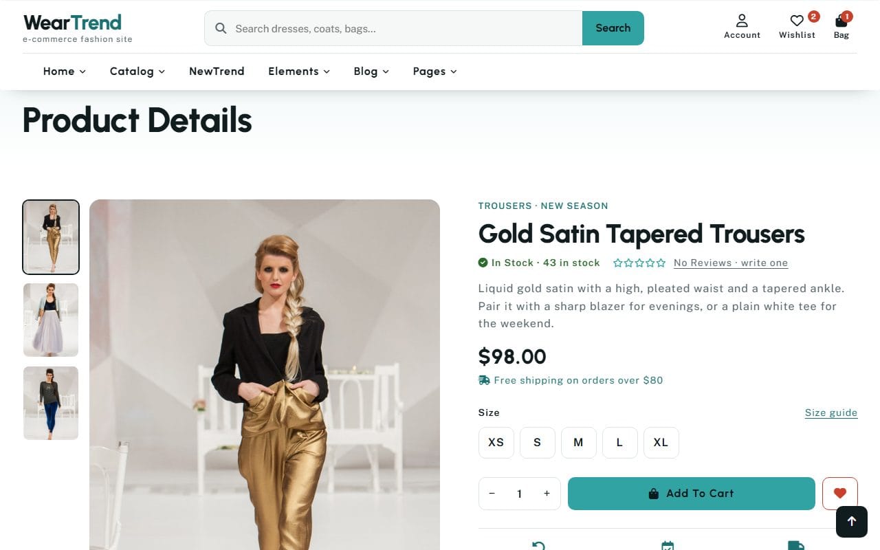
- several photos, with thumbnails to switch between them;
- the stock level, “In Stock · 43 in stock”;
- a short, specific description: liquid gold satin, a high pleated waist, a tapered ankle, and two ideas for what to wear it with;
- the price and, right under it, “Free shipping on orders over $80” again;
- the sizes, with a “Size guide” link sitting right beside them, exactly where the doubt appears;
- the quantity, the add-to-cart button and a heart to save it for later;
- a money-back guarantee with a 30-day return policy, and tabs for the description, shipping and returns, and reviews.
I want to point out one honest detail: the reviews line says “No Reviews · write one”. A new shop, or a new product, won’t have reviews yet, and that is fine. What isn’t fine is filling the space with made-up ones. Shoppers are good at spotting five identical five-star reviews from first-name-only people, and once they spot one fake thing, they doubt everything else on the page, including your returns promise. Start with none, ask your first customers for honest reviews after delivery, and let them build up.
Sizing, delivery and returns: answer the three big doubts
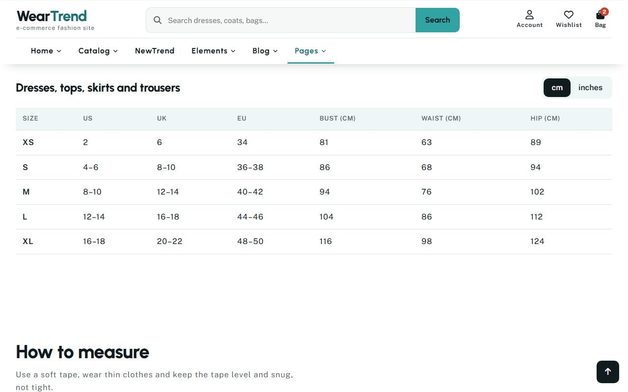
For anything with sizes, the size guide is not a nice extra; it is the difference between an order and a return. WearTrend’s guide is a proper page with a table of US, UK and EU sizes and body measurements, a switch between centimeters and inches, and a section on how to measure yourself. The same thinking applies outside fashion: a furniture shop needs dimensions and a photo with something for scale, a coffee shop needs grind sizes and brewing methods, a print shop needs paper weights.
Delivery and returns deserve the same care. Remember the research: 20% of would-be buyers left because delivery was too slow, and 13% over the returns policy. You can’t always make delivery faster, but you can always make it clear. “Tracked, in 2–4 working days” and “30-day free returns” are short sentences that remove two of the biggest reasons people hesitate. Put them on the product page, not only in the footer.
The cart: no surprises
By the time I opened the cart I had two things in it: a Tulle Midi Skirt in S and the Velvet Stretch Leggings in XS. The cart page listed them with their sizes, a quantity control and a Remove link, and the order summary on the right did something I wish every shop did: it told me plainly that “Your delivery is free”, with a progress bar showing I had passed the threshold, and gave me the subtotal, the delivery cost and the total, all before I had typed a single detail.
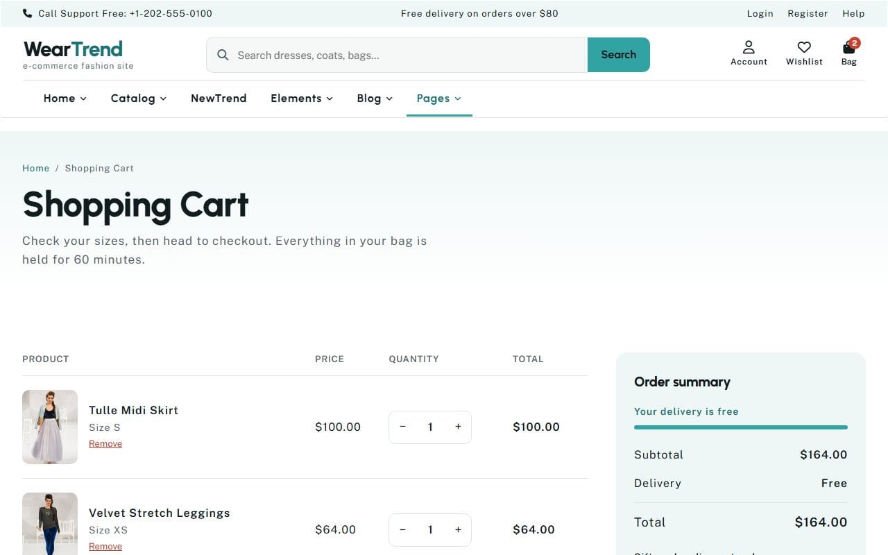
This is where that 12% of shoppers who “couldn’t see or calculate the total cost up front” are won or lost. Show the full total in the cart. If delivery depends on the address, show the cheapest option and say “from”, or let people estimate it with a ZIP code before checkout. Under the summary, WearTrend also lists the payment methods it accepts and repeats the delivery time and returns promise. It is a calm, reassuring place to pause before committing, which is exactly what a cart should be.
One thing I’d be careful with is pressure. The cart says the bag is held for 60 minutes, which is a real and useful piece of information if your stock is limited and it is true. Countdown timers that reset when you reload, or “only 2 left!” labels that never change, are a different thing. They can lift sales for a week, and then cost you the trust that brings people back. If you use urgency, make sure it is real.
Checkout: as short as it can be
Checkout is where the most fixable losses happen, and the research is very specific about why. Baymard’s testing found that an ideal checkout needs only 12 to 14 form elements (7 or 8 actual fields), yet the average US checkout shows 23.48. Every extra field is another moment where someone can decide it isn’t worth it.
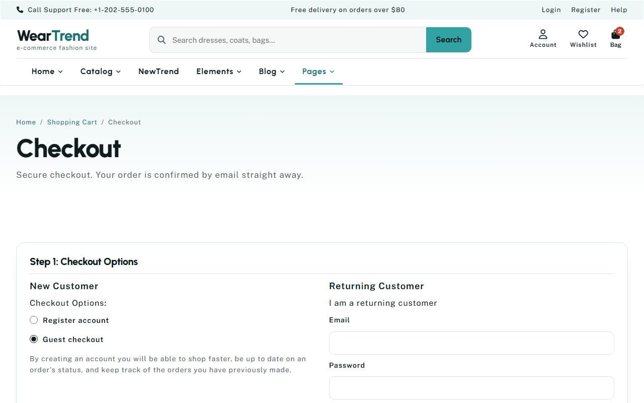
When I reached WearTrend’s checkout, the first step asked whether I was a new or returning customer, and “Guest checkout” was already selected. That one default answers the 18% of shoppers who abandoned because a site wanted them to create an account. A first-time customer doesn’t want a relationship with your shop yet; they want the trousers. Offer an account after the order, when it is a convenience (track your order, faster checkout next time) rather than a gate.
A few more things that keep checkout short and trustworthy:
- Ask for each piece of information once. Use the shipping address as the billing address by default, with a checkbox to change it.
- Use the right input types (email, phone, number) so phones show the right keyboard, and let browsers autofill names and addresses.
- Show what you’re asking for and why. If you need a phone number, say it’s for the courier.
- Make security visible. 19% of would-be buyers left because they didn’t trust the site with their card. A padlock in the address bar, recognizable payment logos and a short line about secure payment all help. WearTrend’s FAQ even answers it directly: “Is my payment secure?”
- Keep the order summary visible while people fill in the form, so they never wonder what they are paying for.
- Make errors helpful, next to the field, in plain words, without clearing everything else they typed.
And test it. Twice a year, buy something from your own shop on your phone, on mobile data, as a guest. You will find something to fix every time.
After the order: the moment most shops waste
When I pressed “Place Order”, the confirmation page greeted me by the name I had typed: “Thanks, Sam Carter! We have emailed a receipt to sam@example.com.” It showed an order number, where the parcel was going, the estimated delivery (2 to 4 working days), when the card would be charged, the order summary with both items and their sizes, and a short “What happens next”.
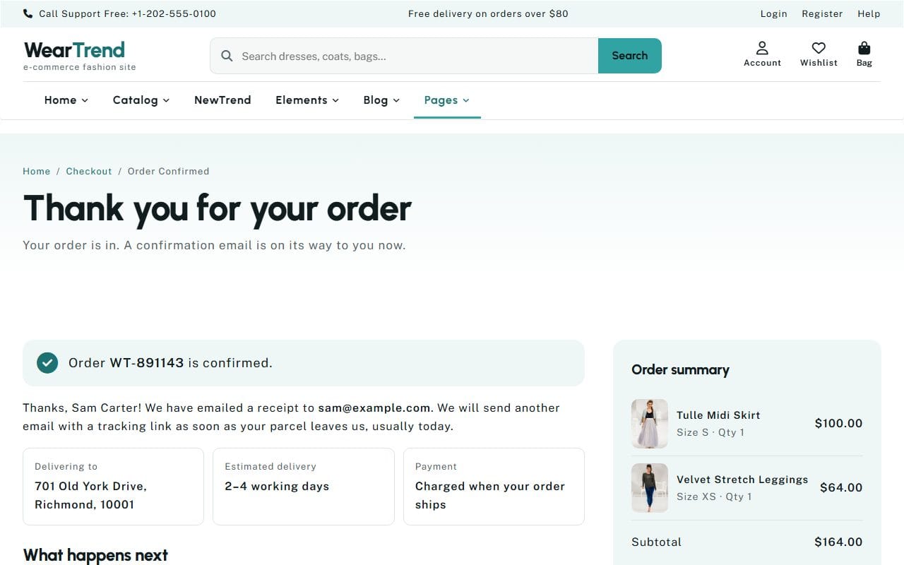
This page and the email that follows are read more carefully than almost anything else in your shop, because the customer has just paid and wants reassurance. Most shops send a bare receipt. Use the moment instead: confirm the details, say when it will ship and how they will hear about it, tell them how to reach you if something is wrong, and say thank you like a person. WearTrend’s order confirmation email does this in the same style as the site: “Thank you, Alex. Your order is in. We are getting your order ready now. You’ll get another email with a tracking link as soon as it leaves us, usually today.”
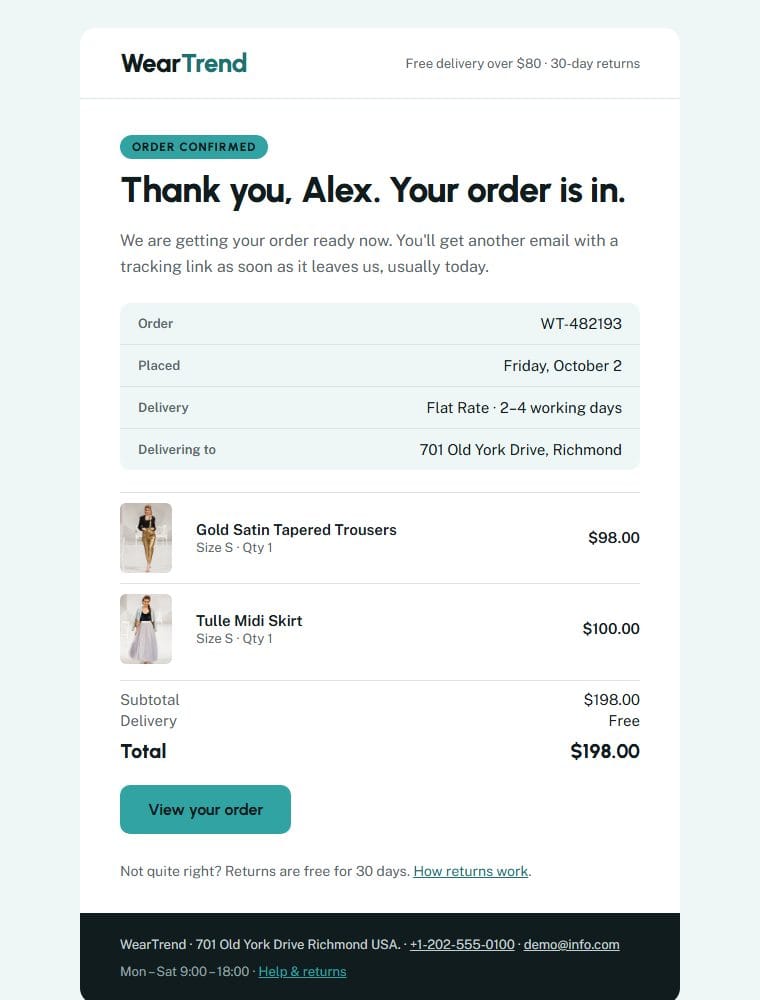
If you take only one thing from this section: write your order emails yourself, in your own voice, and make sure the details in them (dates, totals, return terms) match exactly what the site promised. A mismatch between the checkout and the email is one of the fastest ways to lose a customer you have only just won.
Bringing them back for a second order
A first order proves someone was willing to try you. A second order proves the first one was good. Everything from here is about making the second order easy and natural, not about chasing people.
Give people a way to save things for later
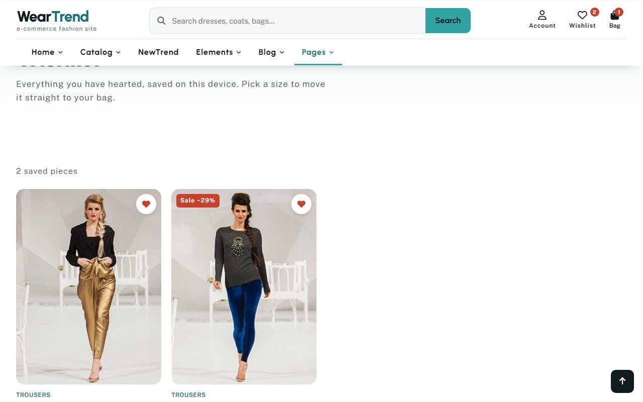
Remember the 42% who were just browsing? Many of them will be back, if you give them a reason to remember what they liked. I hearted two pieces on the product list and the wishlist page showed “2 saved pieces”, each with its sizes and an “Add to bag” button, so moving something from “maybe” to “yes” is a single tap. It is the simplest possible way to turn a browsing visit into a future order.
Stay in touch, but earn it
A newsletter is still the most reliable way to bring customers back, as long as each email is worth opening: new arrivals, restocks of popular items, a guide to caring for what they bought, an honest sale. WearTrend comes with a newsletter welcome email, an account welcome email and a password reset email in the same style as the order email, which is a small thing that makes a shop feel looked after. Ask for the email address after someone has seen something useful, never in a pop-up the second they arrive, and send less often than you think you should.
Make service the thing people remember
This was the heart of the original post, and it still is. People forgive a late parcel if you told them first. They come back to a shop that made a return painless. WearTrend’s FAQ is a good model of the questions every shop gets asked: when will my order ship, do you ship to my country, how do I return something, can I exchange for a different size, is anything final sale, can I change or cancel my order, where is my order, I’m between two sizes, which payment methods do you accept, and is my payment secure. Answer those clearly, put a phone number or contact link where people can see it (WearTrend has it in the top bar of every page), and reply to messages the same day if you possibly can.
Ask for reviews at the right time
The best time to ask for a review is a few days after delivery, when the customer has actually used the thing. Make it one click from the email, keep it short, and publish the critical ones too, with a reply. A shop with a few honest, mixed reviews is far more convincing than one with a wall of perfect ones.
Speed and phones
Most of your visitors will arrive on a phone, often from social media, sometimes on a weak connection. Everything above has to work on a small screen first. WearTrend was rebuilt with phones in mind: product grids drop to two columns on tablets, the filter row can be swiped sideways, the bag panel sits under the header, and nothing scrolls sideways from 320 pixels wide up. Whatever you build on, check those same things on a real phone: can you read the price without zooming, tap a size without hitting the wrong one, and get through checkout with one thumb?
Speed is the other half. Large product photos are the usual culprit: export them at the size they are shown, compress them, and load the ones lower down the page only as people scroll. A shop that feels instant gets more browsing, and more browsing gets more orders.
Measure the few numbers that matter
You don’t need a complicated dashboard. Track these four, month by month:
- Conversion rate: the share of visits that end in an order.
- Add-to-cart rate: the share of visits where something goes in the bag. If this is low, the problem is the products, prices or product pages.
- Checkout completion: of the people who start checkout, how many finish. If this is low, the problem is costs, trust or the checkout itself.
- Repeat purchase rate: the share of customers who order again within, say, six months. This is the number this whole post is about.
Then change one thing at a time and watch the number it should affect. Moving the delivery threshold to the first screen should move checkout completion; adding sizes to the product cards should move add-to-cart. Changing five things at once tells you nothing.
What a website template can and can’t do
I want to be straightforward about this. An HTML shop template like WearTrend gives you the design and the whole shopping flow I have described: the pages, the bag, the cart, the checkout form, the confirmation and the emails, all written and working in the browser. What it doesn’t do on its own is take real payments or manage real stock, because that needs a server and a payment provider behind it. To sell for real, you connect it to a shop platform or a payment service, or use the design as the starting point for a store built on a platform. The templates show you exactly how the shop should look and behave, which is most of the work of getting the details above right.
WearTrend is the one I would start from if you want to see a complete flow, from the first tile to the order email. You can try it yourself on its live demo, and browse our other shop designs in our ecommerce website templates. If you are still deciding whether a template or a custom build is right for your shop, my post on choosing between a template and a custom design goes through the trade-offs, and the one on holding visitors’ attention covers the first few seconds in more depth.
A short checklist for your own shop
- Delivery cost or threshold visible on the first screen and every product page.
- Categories and search on the first screen.
- Filters that match how your customers think, and a sort that works.
- Prices, including sale prices, on every product card.
- Add to bag from the list, with a clear but quiet confirmation.
- Product pages that answer size, stock, delivery and returns near the top.
- Honest reviews, or none yet, never invented ones.
- The full total, including delivery, in the cart.
- Guest checkout by default, and as few fields as possible.
- Visible security and familiar payment options.
- A confirmation page and email that say exactly what happens next.
- A wishlist, a newsletter worth reading, and service people remember.
FAQ
Why do so many people add to cart but not buy?
Many are simply browsing: in Baymard Institute’s research, 42% of US shoppers had abandoned a cart because they weren’t ready to buy. Among the rest, the biggest reasons are unexpected extra costs, slow delivery, not trusting the site with card details, being forced to create an account, and a long checkout. Those are all things a shop can fix.
How do I get first-time buyers to come back?
Make the first order go smoothly, keep your promises on delivery and returns, send a clear and friendly confirmation, and give people reasons to return: a wishlist for things they liked, a newsletter worth opening, and service that solves problems quickly. Ask for a review a few days after delivery.
Should I force customers to create an account?
No. Make guest checkout the default and offer an account after the order, when it is useful to the customer (tracking, saved addresses, faster checkout next time). Forced account creation is one of the top reasons people abandon checkout.
How many fields should a checkout have?
As few as possible. Baymard Institute’s testing suggests an ideal checkout needs around 12 to 14 form elements, while the average US checkout shows over 23. Remove anything you don’t need to deliver the order and take payment.
Can an HTML template work as a real online shop?
It gives you the full design and shopping flow, but taking real payments and managing stock needs a shop platform or payment service behind it. Many shop owners use a template to get the look and flow right, then connect it to the service they use for payments.
More from the blog
Best Free Website Templates for a Small Business (2026)
Free templates for restaurants, gyms, salons, real estate, clinics, agencies and more, all rebuilt in 2026. What to check before you download, and when paying saves time.
Read article →
Astro vs Next.js for a Business or Marketing Website (2026)
We built the same restaurant website in Astro and in Next.js with an admin panel, then measured both. Where Astro wins, where Next.js wins, and how to choose.
Read article →
HTML Template to WordPress: Convert It Yourself or Use a WordPress Version?
We turned our Bistrofeast HTML template into a WordPress theme by hand. Every step, the mistakes, how long it took, and when a WordPress version saves you days.
Read article →