
Every design I start begins the same way: an hour of looking at other people’s work before I draw anything. Not to copy a layout, but to remind myself what is possible and to notice small ideas I wouldn’t have thought of on my own.
This post covers the places I actually look for web design inspiration, six ideas from our own 2026 redesigns that you can borrow for almost any kind of site, and the way I turn a folder of screenshots into a design that is still mine.
Where to find web design inspiration
I checked every site below in October 2026. They are grouped by what they are good for, because the right place to look depends on what you are stuck on.
Whole websites, judged and curated
- Awwwards: sites voted on by a jury of designers, with a Site of the Day. Great for ambition, though many winners are experimental studio sites rather than businesses like yours.
- CSS Design Awards: another award gallery, with its own Site of the Day and UI awards.
- SiteInspire: a calmer, curated showcase you can filter by style, type of site and subject.
- Httpster and Minimal Gallery: hand-picked galleries that lean toward clean, modern sites. Good when you want restraint rather than fireworks.
Landing pages and one-page sites
- Land-book and Lapa Ninja: big libraries of landing pages, useful when you need to see how others structure a page that has to sell one thing.
- One Page Love: only single-page websites, which helps if your whole site will be one long scroll.
- SaaS Landing Page: landing page examples from software companies, handy when you are working on pricing, feature or sign-up sections.
One part of a page at a time
- Mobbin and Refero: searchable screenshots of real app and web interfaces. When I need to see fifty sign-up forms or checkout pages side by side, this is where I go.
- Footer: a gallery of nothing but website footers. It sounds niche until you have to design one.
- Typewolf: fonts as they are used on real sites, with pairing ideas. Type does more for a design’s personality than almost anything else.
Process and work in progress
- Behance: full case studies, often with the sketches and the reasoning, not just the final screens.
- Dribbble: single shots from designers. Wonderful for color, illustration and small details; just remember many shots are concepts that were never built, so check that an idea works on a real page.
The place most people forget: your own niche
Award galleries are full of studios and tech companies. If you are designing for a bakery, a clinic or a gym, the most useful inspiration is the best sites in that field, especially in bigger cities than yours. Look at what they put on the first screen, what they make easy and what they leave out. Our own website templates are sorted by business type, and every one has a live demo you can scroll through for exactly this.
6 ideas worth borrowing from our 2026 redesigns
When we redesigned our templates this year, each one started from what that kind of visitor needs, not from a trend. These are the ideas I think travel best to other kinds of site.
1. Put something live on the first screen
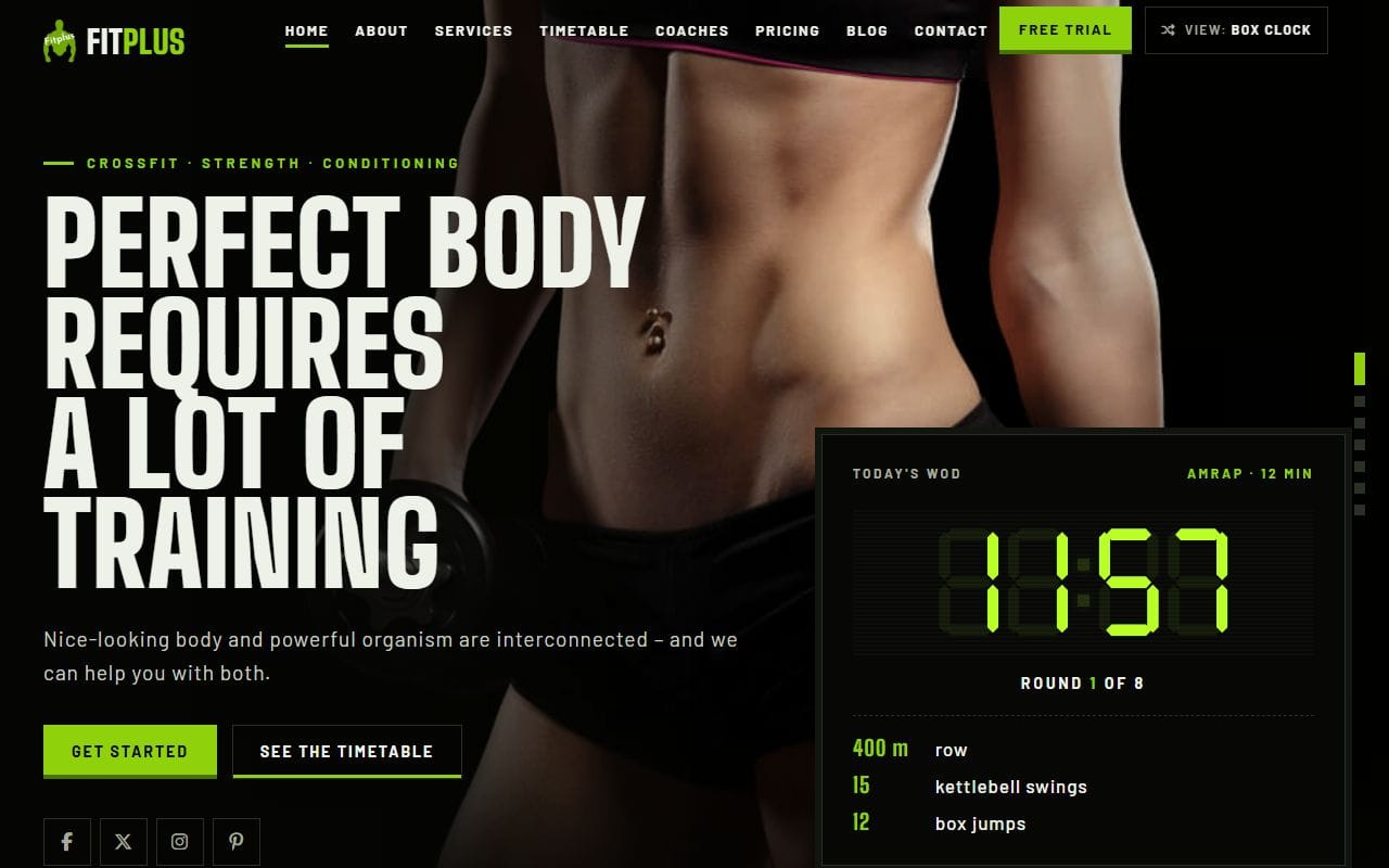
FitPlus, a gym template, has a “Today’s WOD” panel in the hero with the exercises and a timer that actually counts down. It makes the site feel like the gym is open right now. The same idea works anywhere: today’s opening hours, this week’s class, the next available appointment.
2. Show prices before anyone has to ask
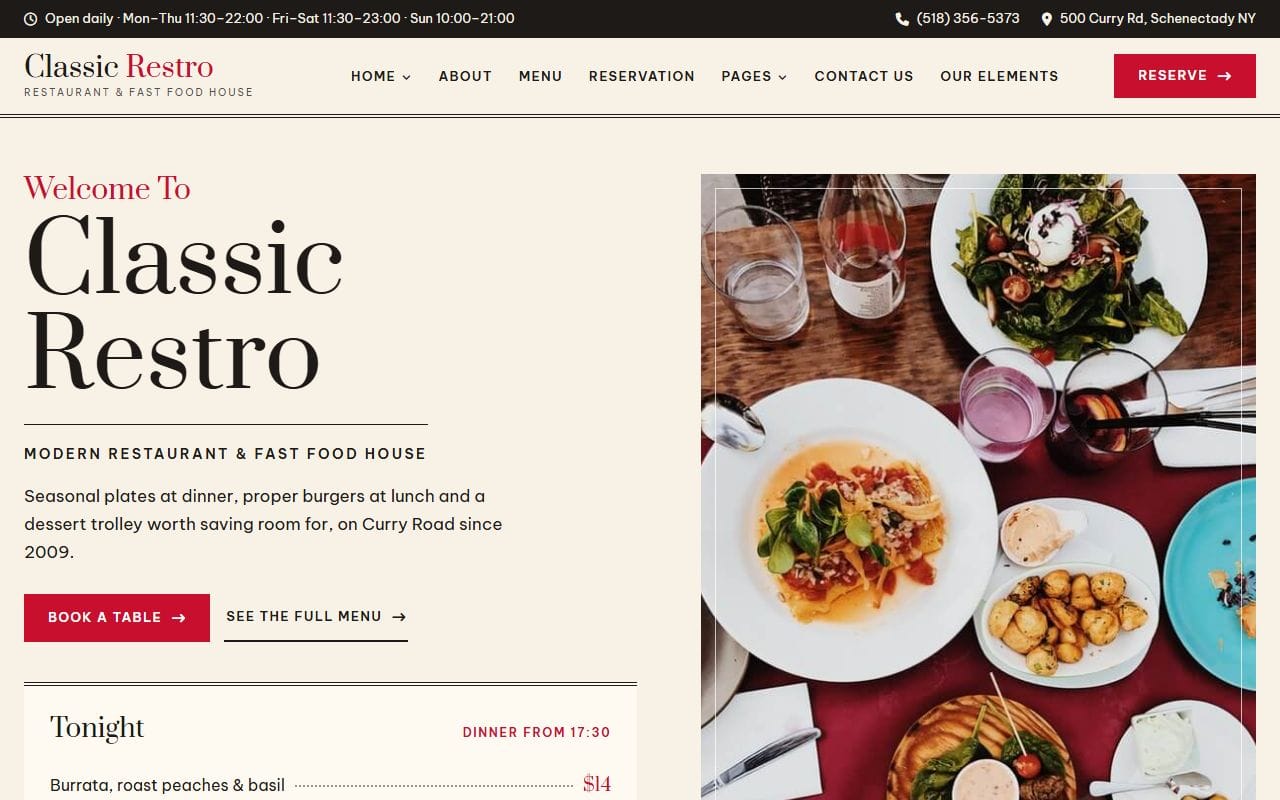
ClassicRestro lists tonight’s dishes with their prices on the first screen, under the “book a table” button. A visitor knows what kind of place it is and what it costs in five seconds. Any business that gets “how much is it?” emails can borrow this.
3. Let people try something, not just read about it
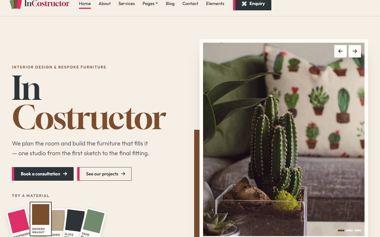
InCostructor, an interior design template, has a row of material swatches in the hero. Click one and the site’s accent color changes to match. It’s a small thing, but it says “we think about materials” better than a paragraph could. Think about the one interaction that sums up your business.
4. Let the design show the craft
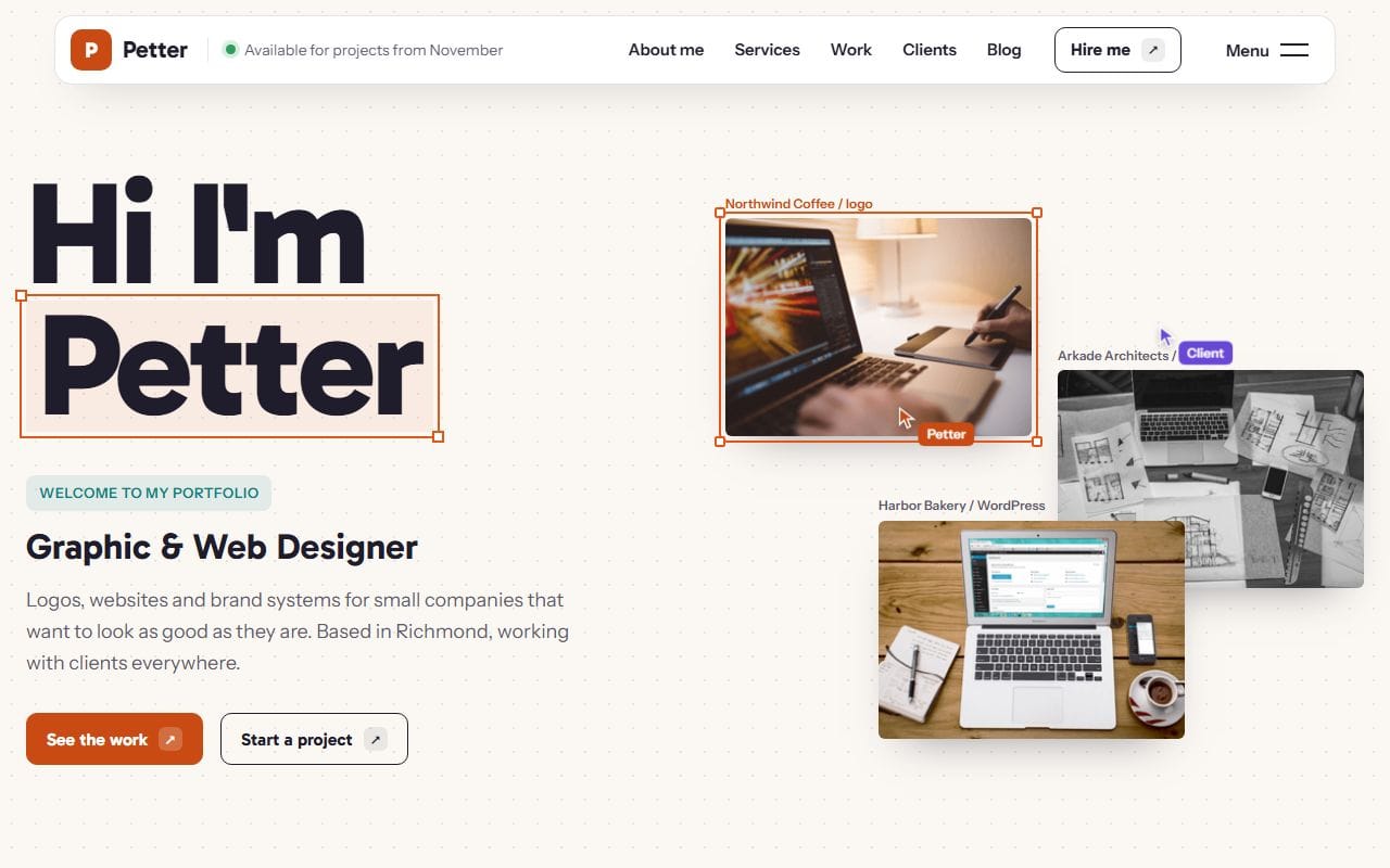
Petter is a graphic designer’s portfolio, and its home page borrows the look of a design app: selection handles around the name, small labels on the work samples. There is also a little “available for projects” note in the header, which answers the first question a client has. If your work has a recognizable tool or material, the design can quietly nod to it.
5. Put the choices up front
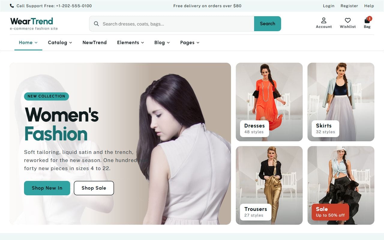
WearTrend, a fashion shop, puts its main categories beside the hero, each with a count (“48 styles”). Shoppers come to browse, so the browsing starts on the first screen instead of after a slideshow. For a service business, the equivalent is your three main services as tiles before anything else.
6. Answer the practical questions next to the button
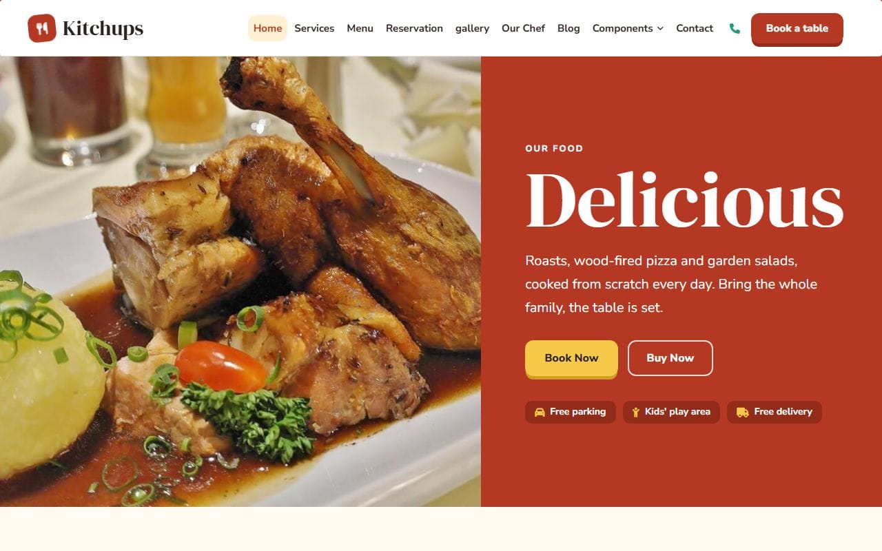
Kitchups has three small labels under its buttons: free parking, a kids’ play area, free delivery. Those are the things that decide whether a family drives over, and they are on the first screen instead of hidden on an About page. What are the two or three practical things your visitors always ask about?
How I use inspiration without copying
- Collect widely, then cut. I save twenty or thirty screenshots, then keep the ten that I can explain. If I can’t say why something works, it doesn’t stay.
- Write one line under each. “Price visible without scrolling.” “Photos edge to edge on the phone.” The line is the idea; the screenshot is just a reminder of it.
- Sort by section, not by site. Heroes together, menus together, footers together. Then take one idea per section, from different sources.
- Start from your content. Put your real headline, photos and services into the wireframe first, then try the ideas against them. An idea that needs content you don’t have isn’t for this project.
- Change the details on purpose. Your colors, your type, your photos, your wording. Borrow the reasoning, never the artwork, the text or the code.
- Check it on a phone. Plenty of inspiring desktop layouts fall apart on a small screen. If it doesn’t work there, it doesn’t work.
For the collecting, any tool you like will do: a folder of screenshots, a Pinterest board, a Figma or FigJam page, or a Milanote board. I use a plain design file with one column per section, because it makes step 3 easy. If you want to go a step further before designing, my post on why wireframing is important picks up where this one ends.
FAQ
Is it OK to copy a website design I like?
Borrowing an idea, such as prices on the first screen or a gallery filtered by subject, is how design has always worked. Copying someone’s actual layout, graphics, photos, text or code is not, and can break copyright. Take the reasoning and make it yours.
What is the best website for web design inspiration?
It depends on what you need. Awwwards and CSS Design Awards for ambitious whole sites, Land-book and One Page Love for landing pages, Mobbin and Refero for specific interface patterns, and the best sites in your own industry for what actually works for your customers.
How do I make a mood board for a website?
Collect screenshots of sites, color palettes, fonts and photos that feel right, write a short note on why you kept each one, and arrange them on one page. Keep it small enough to see at a glance; ten good references beat a hundred.
Can I use a template as inspiration?
Yes. Templates are a quick way to see a whole working structure for a type of business. Scroll a few live demos in your field, note what each one puts first, and use that as the starting point for your own layout, or download one and adapt it.
More from the blog
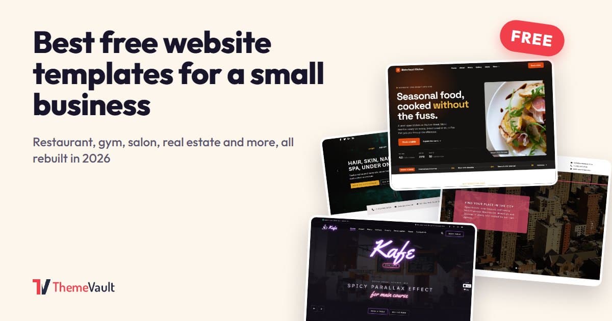
Best Free Website Templates for a Small Business (2026)
Free templates for restaurants, gyms, salons, real estate, clinics, agencies and more, all rebuilt in 2026. What to check before you download, and when paying saves time.
Read article →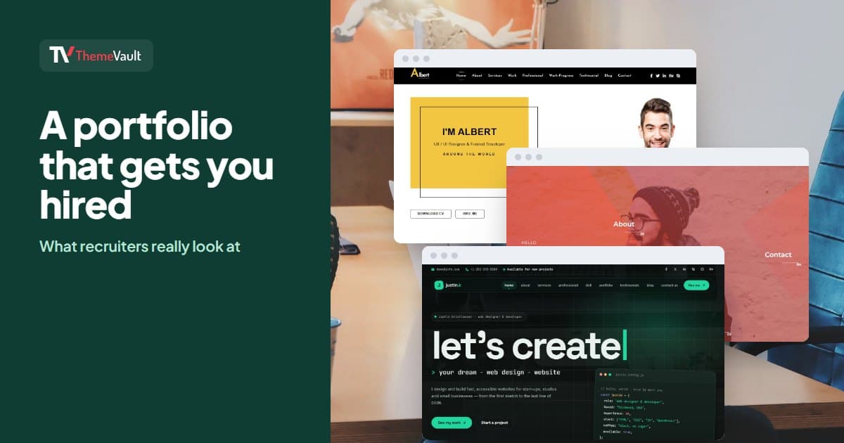
How to Build a Portfolio Website That Gets You Hired (2026)
Recruiters give your portfolio about a minute. I tested our portfolio templates the way a hiring manager would: opened the projects, pressed the CV buttons, sent the contact forms. Here is what matter...
Read article →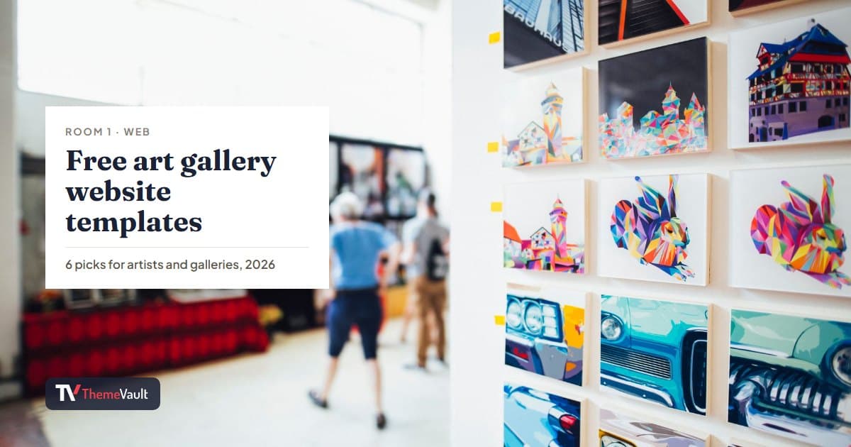
Free Art Gallery Website Templates (2026): 6 Responsive Picks
Six free, responsive art gallery and photography templates you can download today. I checked each live demo rather than the feature lists — here is which ones have a working lightbox, which use masonr...
Read article →